Plotting Examples
Built-in functionality
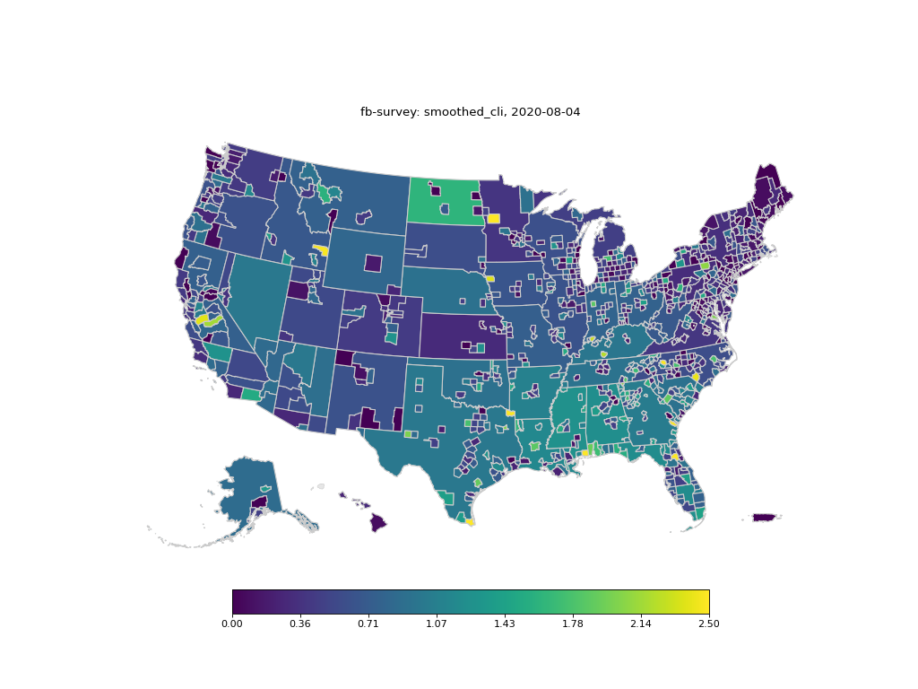
The returned DataFrame from covidcast.signal() can be plotted using the built-in
covidcast.plot(). Currently, state, county, hospital referral regions
(HRR), and metropolitan statistical area (MSA) geography types are supported.
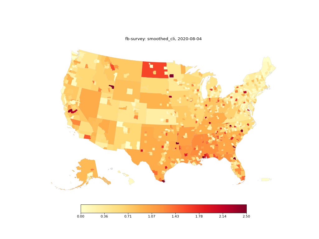
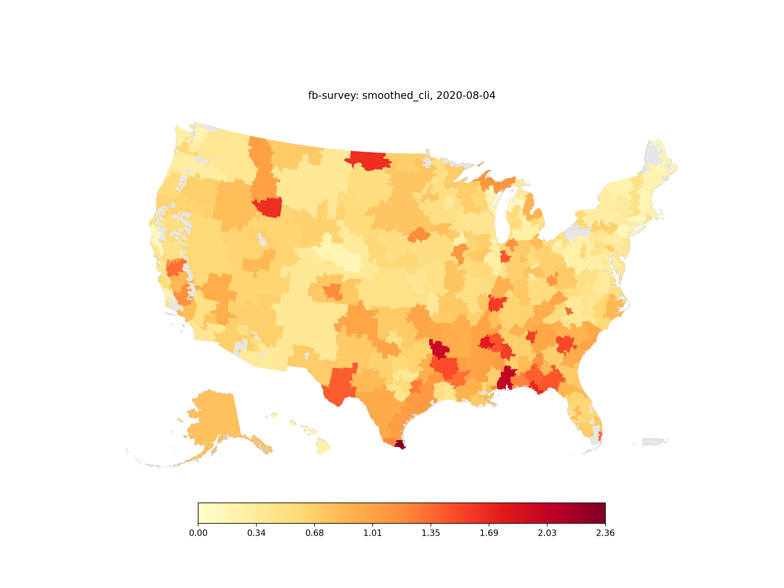
County-level maps show estimates for each county, and color each state as a single polygon with the megacounty estimates, if available. (Megacounties represent all counties with insufficient sample size to report in that state; see the geographic coding documentation for details.)
>>> import covidcast
>>> from datetime import date
>>> from matplotlib import pyplot as plt
>>> data = covidcast.signal("fb-survey",
...                         "smoothed_cli",
...                         date(2020, 8, 3),
...                         date(2020, 8, 4),
...                         geo_type="county")
>>> covidcast.plot(data)
>>> plt.show()
(Source code, png, hires.png, pdf)

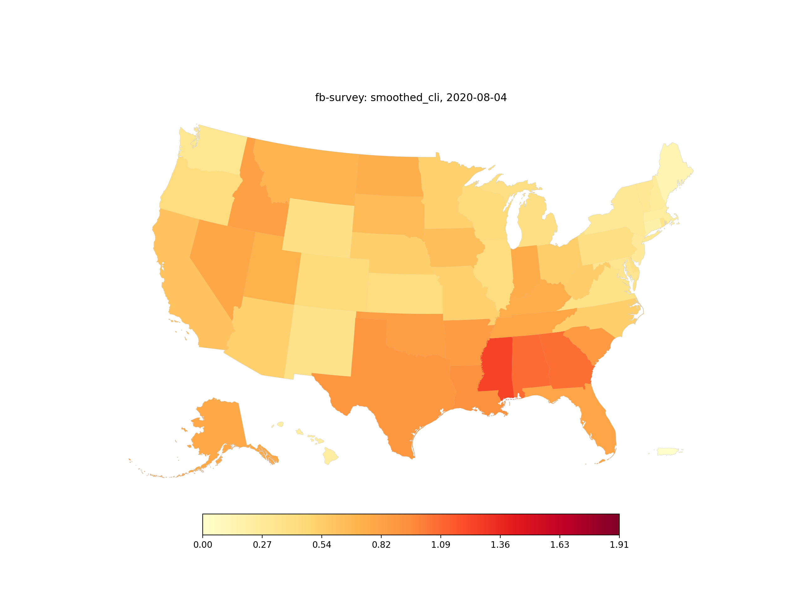
State-level data can also be mapped:
>>> data = covidcast.signal("fb-survey",
...                         "smoothed_cli",
...                         date(2020, 8, 3),
...                         date(2020, 8, 4),
...                         geo_type="state")
>>> covidcast.plot(data)
>>> plt.show()
(Source code, png, hires.png, pdf)

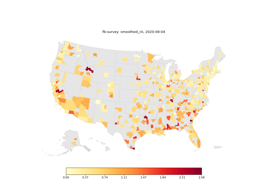
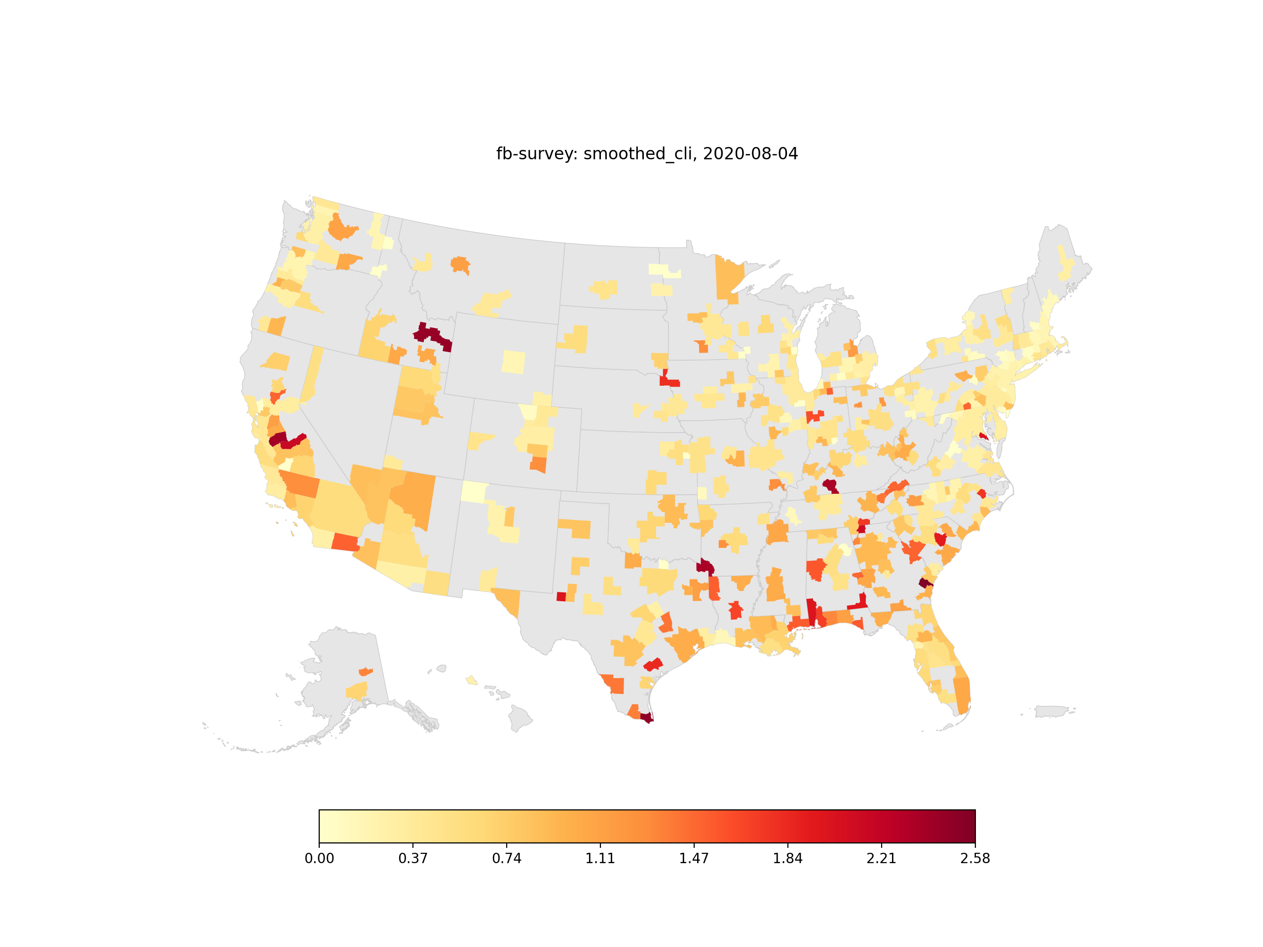
Regions where no information is present are presented in light grey, as demonstrated by these MSA and HRR plots.
>>> data = covidcast.signal("fb-survey",
...                         "smoothed_cli",
...                         date(2020, 8, 3),
...                         date(2020, 8, 4),
...                         geo_type="msa")
>>> covidcast.plot(data)
>>> plt.show()
(Source code, png, hires.png, pdf)

>>> data = covidcast.signal("fb-survey", "smoothed_cli",
...                         date(2020, 8, 3), date(2020, 8, 4),
...                         geo_type="hrr")
>>> covidcast.plot(data)
>>> plt.show()
(Source code, png, hires.png, pdf)
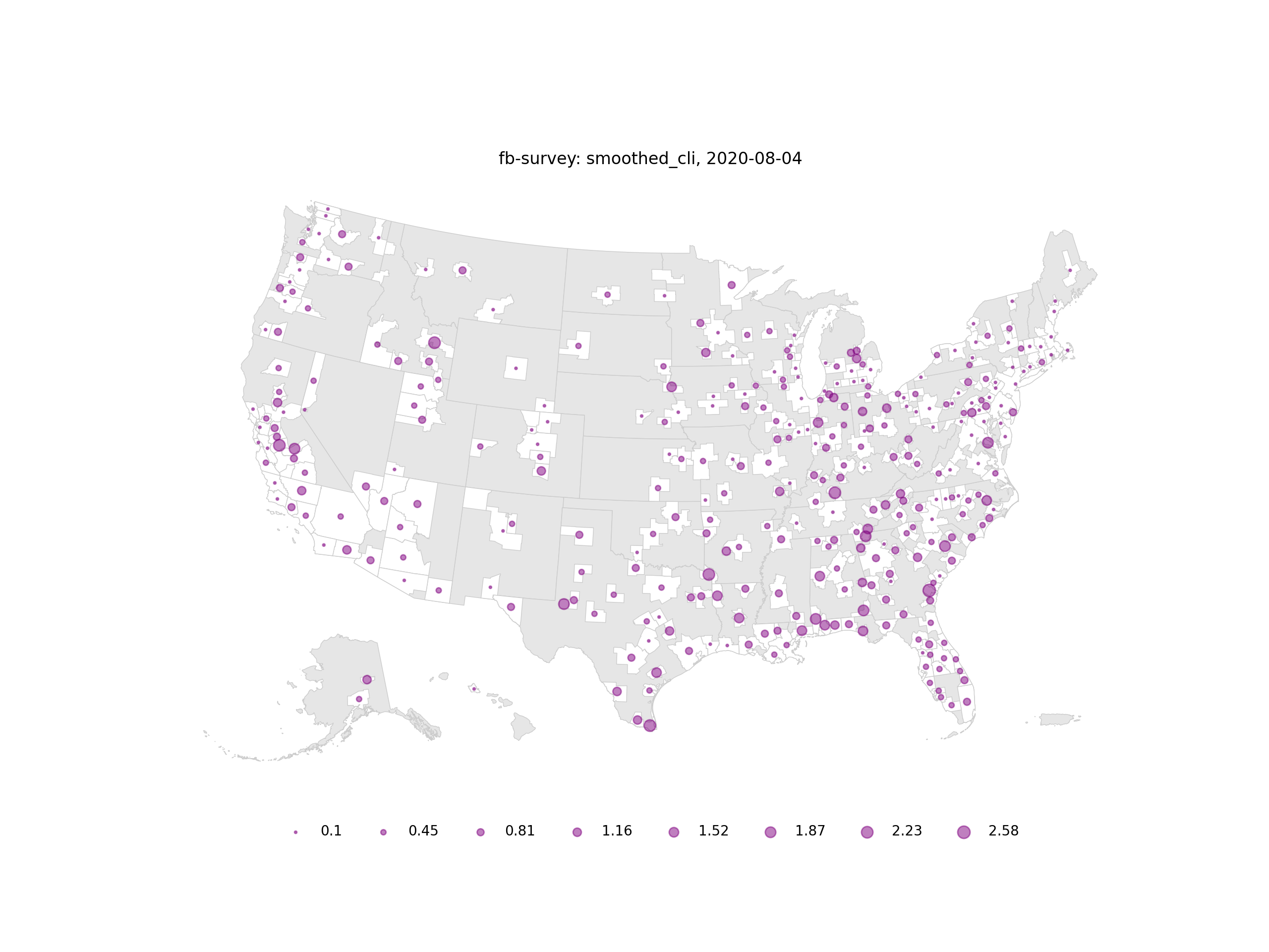
As an alternative to choropleths, bubble plots can be created with the plot_type="bubble"
argument.
>>> covidcast.plot(data, plot_type="bubble")
>>> plt.show()
(Source code, png, hires.png, pdf)
Additional keyword arguments can also be provided. These correspond to most of the arguments available for the GeoPandas plot() function.
>>> covidcast.plot(data,
...                cmap="viridis",
...                edgecolor="0.8")
>>> plt.show()
(Source code, png, hires.png, pdf)
The function returns a Matplotlib Figure object which can be stored and altered further.
>>> fig = plotting.plot(data)
>>> fig.set_dpi(100)
Animations
To create an animation, simply pass the signal DataFrame to covidcast.animate().
The following code creates an MP4 file named test_plot.mp4 which animates our daily signal for
the month of August.
>>> data = covidcast.signal("fb-survey",
...                         "smoothed_cli",
...                         date(2020, 8, 1),
...                         date(2020, 8, 31),
...                         geo_type = "county")
>>> covidcast.animate(data, "test_plot.mp4")
Video format, frame rate, and resolution are adjustable. Like the static maps, additional plotting
keyword arguments can be provided and are passed to covidcast.plot().
>>> covidcast.animate(df,
...                   "test_plot2.mp4",
...                   fps=2,
...                   cmap="viridis")
Further customization
If more control is desired, the signal data can be passed to covidcast.get_geo_df(), which
will return a
GeoPandas GeoDataFrame with
relevant polgons that can be used with the mapping tools
provided by that package. The geometry information is sourced from the
2019 US Census Cartographic Boundary Files.
The covidcast.get_geo_df() method can return different joins depending on your use case. By
default, it will try to compute the right join between the input data (left side of join) to the
geometry data (right side of join), so that the returned GeoDataFrame will contain all the possible
geometries with the signal values filled if present. When mapping counties, those that do not have values but have
a corresponding megacounty will inherit the megacounty values. To have a singe polygon returned for each
megacounty, use the combine_megacounties=True argument.
This operation depends on having only one row of signal information per
geographic region. If this is not the the case, you must specify another join
with the join_type argument.
>>> data = covidcast.signal("fb-survey",
...                         "smoothed_cli",
...                         date(2020, 8, 4),
...                         date(2020, 8, 4),
...                         geo_type = "county")
>>> covidcast.get_geo_df(data)
     geo_value time_value      issue  lag     value    stderr  sample_size geo_type data_source        signal                                           geometry state_fips
0        24510 2020-08-04 2020-08-06  2.0  0.375601  0.193356     587.6289   county   fb-survey  smoothed_cli  POLYGON ((-76.71131 39.37193, -76.62619 39.372...         24
1        31169 2020-08-04 2020-08-06  2.0  0.928208  0.168783    1059.8130   county   fb-survey  smoothed_cli  POLYGON ((-97.82082 40.35054, -97.36869 40.350...         31
2        37077 2020-08-04 2020-08-06  2.0  0.627742  0.081884    3146.0176   county   fb-survey  smoothed_cli  POLYGON ((-78.80252 36.21349, -78.80235 36.220...         37
3        46091 2020-08-04 2020-08-06  2.0  0.589745  0.161989     778.7429   county   fb-survey  smoothed_cli  POLYGON ((-97.97924 45.76257, -97.97878 45.935...         46
4        39075 2020-08-04 2020-08-06  2.0  0.785641  0.099959    2767.5054   county   fb-survey  smoothed_cli  POLYGON ((-82.22066 40.66758, -82.12620 40.668...         39
...        ...        ...       ...        ...  ...       ...       ...          ...      ...         ...           ...                                                ...        ...
3228     53055 2020-08-04 2020-08-06  2.0  0.440817  0.143404     944.1731   county   fb-survey  smoothed_cli  MULTIPOLYGON (((-122.97714 48.79345, -122.9379...         53
3229     39133 2020-08-04 2020-08-06  2.0  0.040082  0.089324     310.8495   county   fb-survey  smoothed_cli  POLYGON ((-81.39328 41.02544, -81.39322 41.040...         39
3230     08025 2020-08-04 2020-08-06  2.0  0.440306  0.123763    1171.5823   county   fb-survey  smoothed_cli  POLYGON ((-104.05840 38.26084, -104.05392 38.5...         08
3231     13227 2020-08-04 2020-08-06  2.0  1.009511  0.092993    3605.8731   county   fb-survey  smoothed_cli  POLYGON ((-84.65437 34.54895, -84.52139 34.550...         13
3232     21145 2020-08-04 2020-08-06  2.0  1.257862  0.915558     150.4266   county   fb-survey  smoothed_cli  POLYGON ((-88.93308 37.22775, -88.93174 37.227...         21
[3233 rows x 13 columns]
Note that there are 3233 output rows for the 3233 counties present in the Census shapefiles.
>>> covidcast.get_geo_df(covid, join_type="left")
    geo_value time_value      issue  lag     value    stderr  sample_size geo_type data_source        signal                                           geometry state_fips
0       01000 2020-08-04 2020-08-06    2  1.153447  0.136070    1759.8539   county   fb-survey  smoothed_cli                                               None        NaN
1       01001 2020-08-04 2020-08-06    2  0.539568  0.450588     107.9345   county   fb-survey  smoothed_cli  POLYGON ((-86.91759 32.66417, -86.81657 32.660...         01
2       01003 2020-08-04 2020-08-06    2  1.625496  0.522036     455.2964   county   fb-survey  smoothed_cli  POLYGON ((-88.02927 30.22271, -88.02399 30.230...         01
3       01015 2020-08-04 2020-08-06    2  0.000000  0.378788     115.2302   county   fb-survey  smoothed_cli  POLYGON ((-86.14371 33.70913, -86.12388 33.710...         01
4       01051 2020-08-04 2020-08-06    2  0.786565  0.435877     112.5569   county   fb-survey  smoothed_cli  POLYGON ((-86.41333 32.75059, -86.37497 32.753...         01
..        ...        ...        ...  ...       ...       ...          ...      ...         ...           ...                                                ...        ...
840     55141 2020-08-04 2020-08-06    2  1.190476  0.867751     144.3682   county   fb-survey  smoothed_cli  POLYGON ((-90.31605 44.42450, -90.31596 44.424...         55
841     56000 2020-08-04 2020-08-06    2  0.822092  0.254670     628.9937   county   fb-survey  smoothed_cli                                               None        NaN
842     56021 2020-08-04 2020-08-06    2  0.269360  0.315094     197.9646   county   fb-survey  smoothed_cli  POLYGON ((-105.28064 41.33100, -105.27824 41.6...         56
843     56025 2020-08-04 2020-08-06    2  0.170940  0.304654     192.0237   county   fb-survey  smoothed_cli  POLYGON ((-107.54353 42.78156, -107.50142 42.7...         56
844     72000 2020-08-04 2020-08-06    2  0.000000  0.228310     100.9990   county   fb-survey  smoothed_cli                                               None        NaN
[845 rows x 13 columns]
With the left join, there are 845 rows since the signal returned information for 845 counties and megacounties.
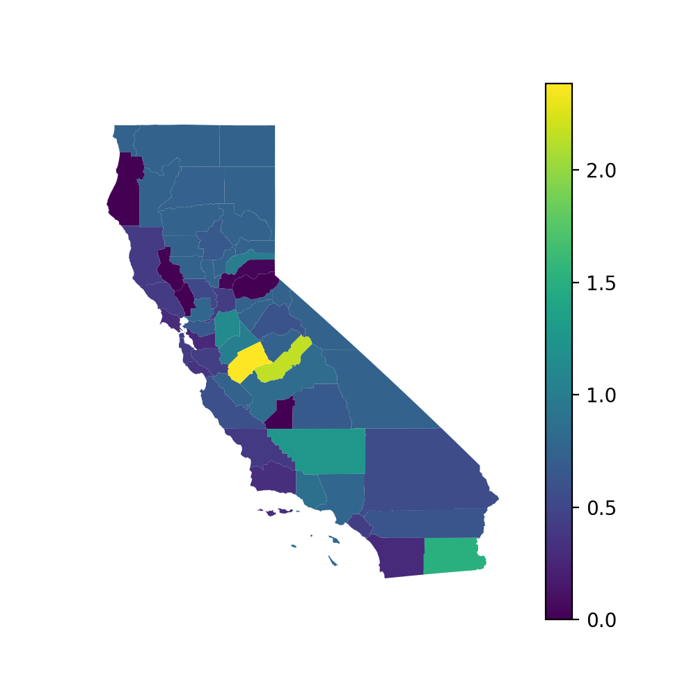
With the GeoDataFrame, you can plot various data points in whatever style you prefer. For example, plotting California on August 4, 2020 with a Mercator projection:
>>> CA = geo_data.loc[geo_data.state_fips == "06",:]
>>> CA.to_crs("EPSG:3395")
>>> CA.plot(column="true_value", figsize=(5,5), legend=True)
>>> plt.axis("off")
>>> plt.show()
(Source code, png, hires.png, pdf)
