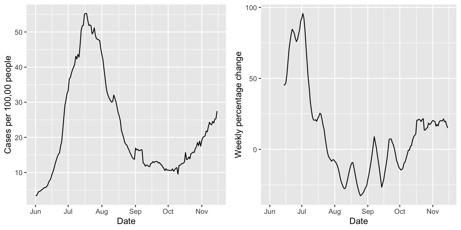
A basic way of assessing growth in a signal is to look at its percentage change over two neighboring time windows. We investigate this in the current vignette, using the pct_change() function in the modeltools package. As in the getting started guide, we focus on state-level COVID-19 case rates from the USAFacts data source, smoothed via 7-day trailing averages, from June to mid November.
library(covidcast)
## We encourage COVIDcast API users to register on our mailing list:
## https://lists.andrew.cmu.edu/mailman/listinfo/delphi-covidcast-api
## We'll send announcements about new data sources, package updates,
## server maintenance, and new features.
start_day <- "2020-06-01" end_day <- "2020-11-15" geo_values <- c("ca", "fl", "ny", "tx") case_rates <- suppressMessages( covidcast_signal(data_source = "usa-facts", signal = "confirmed_7dav_incidence_prop", start_day = start_day, end_day = end_day, geo_type = "state", geo_values = geo_values)) summary(case_rates)
## A `covidcast_signal` data frame with 672 rows and 9 columns.
##
## data_source : usa-facts
## signal      : confirmed_7dav_incidence_prop
## geo_type    : state
##
## first date                          : 2020-06-01
## last date                           : 2020-11-15
## median number of geo_values per day : 4
Percentage change
The pct_change() function operates on a covidcast_signal data frame, and takes an argument n, indicating the size of the local window (in days) to use. For example, if n = 10, then to compute the percentage change on November 10, we use 100 * (B - A) / A, where A is the sum of the values between November 6 and November 10, and A is the sum of the values between November 1 and November 5. The default is n = 14, giving the percentage change between back-to-back weeks.
library(modeltools)
library(dplyr)

case_rates <- pct_change(case_rates, n = 14)

case_rates %>%
  arrange(geo_value) %>%
  select(geo_value, time_value, value, pct_change) %>%
  print(n = 21)
## # A tibble: 672 x 4
##    geo_value time_value value pct_change
##    <chr>     <date>     <dbl>      <dbl>
##  1 ca        2020-06-01  6.70      NA
##  2 ca        2020-06-02  6.39      NA
##  3 ca        2020-06-03  6.50      NA
##  4 ca        2020-06-04  6.86      NA
##  5 ca        2020-06-05  7.11      NA
##  6 ca        2020-06-06  6.81      NA
##  7 ca        2020-06-07  6.74      NA
##  8 ca        2020-06-08  6.75      NA
##  9 ca        2020-06-09  6.99      NA
## 10 ca        2020-06-10  7.19      NA
## 11 ca        2020-06-11  7.32      NA
## 12 ca        2020-06-12  7.48      NA
## 13 ca        2020-06-13  7.72      NA
## 14 ca        2020-06-14  7.82       8.84
## 15 ca        2020-06-15  7.88      11.1
## 16 ca        2020-06-16  8.02      11.9
## 17 ca        2020-06-17  8.53      13.0
## 18 ca        2020-06-18  8.62      14.6
## 19 ca        2020-06-19  8.56      16.0
## 20 ca        2020-06-20  8.72      15.8
## 21 ca        2020-06-21  8.94      15.6
## # … with 651 more rows
We can see that a column pct_change column has been appended to the output data frame, which contains the percentage change values estimates. Next we plot these values alongside the signal itself.
library(ggplot2)
library(gridExtra)

state = "fl"

p1 <- ggplot(case_rates %>% filter(geo_value == state),
             aes(x = time_value, y = value)) +
  geom_line() +
  labs(x = "Date", y = "Cases per 100,00 people")

p2 <- ggplot(case_rates %>% filter(geo_value == state),
             aes(x = time_value, y = pct_change)) +
  geom_line() +
  labs(x = "Date", y = "Weekly percentage change")

grid.arrange(p1, p2, nrow = 1)
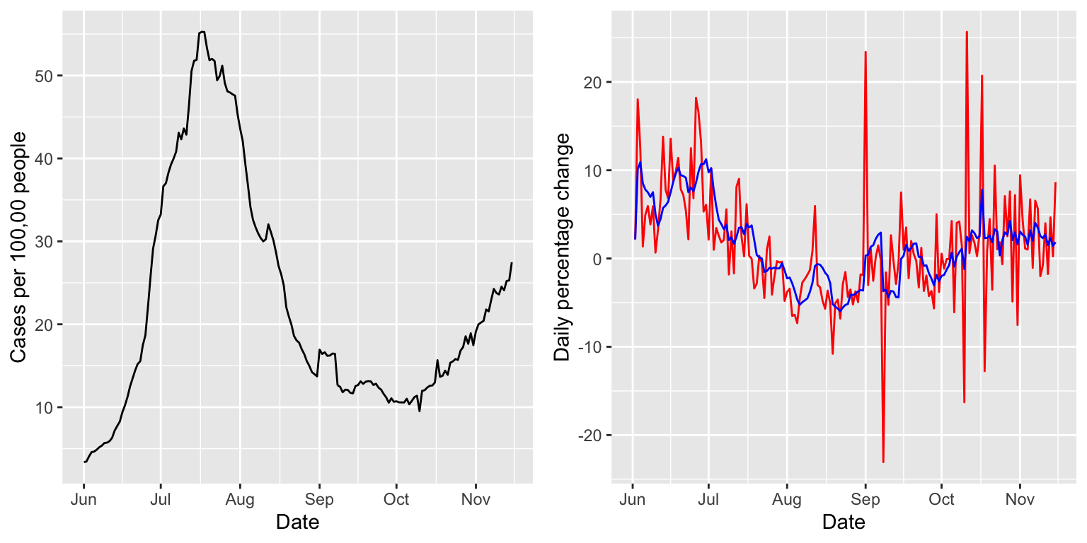
Smoothing via 7-day averaging
Computing the percentage change between back-to-back days, using n = 2, will generally return a pretty volatile sequence; below we show how to smooth this sequence by post-applying a 7-day trailing average, with a suitable application of slide_by_geo().
case_rates <- case_rates %>%
  pct_change(n = 2, col_name = "pct_change_daily") %>%
  slide_by_geo(~ Mean(.x$pct_change_daily), n = 7,
               col_name = "pct_change_daily_7dav")

case_rates %>%
  arrange(geo_value) %>%
  select(geo_value, time_value, value, pct_change_daily,
         pct_change_daily_7dav) %>%
  head(n = 7)
## # A tibble: 7 x 5
##   geo_value time_value value pct_change_daily pct_change_daily_7dav
##   <chr>     <date>     <dbl>            <dbl>                 <dbl>
## 1 ca        2020-06-01  6.70           NA                   NaN
## 2 ca        2020-06-02  6.39           -4.66                 -4.66
## 3 ca        2020-06-03  6.50            1.69                 -1.48
## 4 ca        2020-06-04  6.86            5.63                  0.887
## 5 ca        2020-06-05  7.11            3.59                  1.56
## 6 ca        2020-06-06  6.81           -4.24                  0.403
## 7 ca        2020-06-07  6.74           -0.977                 0.173
p1 <- ggplot(case_rates %>% filter(geo_value == state), aes(x = time_value, y = value)) + geom_line() + labs(x = "Date", y = "Cases per 100,00 people") p2 <- ggplot(case_rates %>% filter(geo_value == state), aes(x = time_value)) + geom_line(aes(y = pct_change_daily), col = "red") + geom_line(aes(y = pct_change_daily_7dav), col = "blue") + labs(x = "Date", y = "Daily percentage change") grid.arrange(p1, p2, nrow = 1)