The epiprocess package provides advanced visualization
capabilities for both epi_df and epi_archive
objects.
Static Plotting with Many Keys
When plotting an epi_df with a large number of key
combinations (e.g., all US states), epiprocess
automatically subsamples the keys to keep the plot readable and
performant. You can control this behavior with the
.max_keys argument (e.g., set it to Inf to
display all keys).
# Fetching HHS admissions for all states
df <- pub_covidcast(
  source = "hhs",
  signals = "confirmed_admissions_covid_1d",
  geo_type = "state",
  time_type = "day",
  geo_values = "*",
  time_values = epirange(20220901, 20230101)
) %>%
  as_epi_df()
#> Keeping this data in "long" format, with `signal` and `value` columns.
#> → To convert to wide format with a(n) `confirmed_admissions_covid_1d` column
#>   instead, pass `signal_format = "pivot_wide"` instead.
#> → Silence with `signal_format = "add_key"`
#> Adding `signal` to `other_keys`.

# Static plot with many keys (subsampling will occur)
autoplot(
  df, value
)
#> Warning: Too many key combinations to display clearly. Showing 10 of 54.
#> → To plot all keys, use `autoplot(..., .max_keys = Inf)`.
#> → To explore all keys interactively, use `autoplot(..., .interactive =
#>   TRUE)`.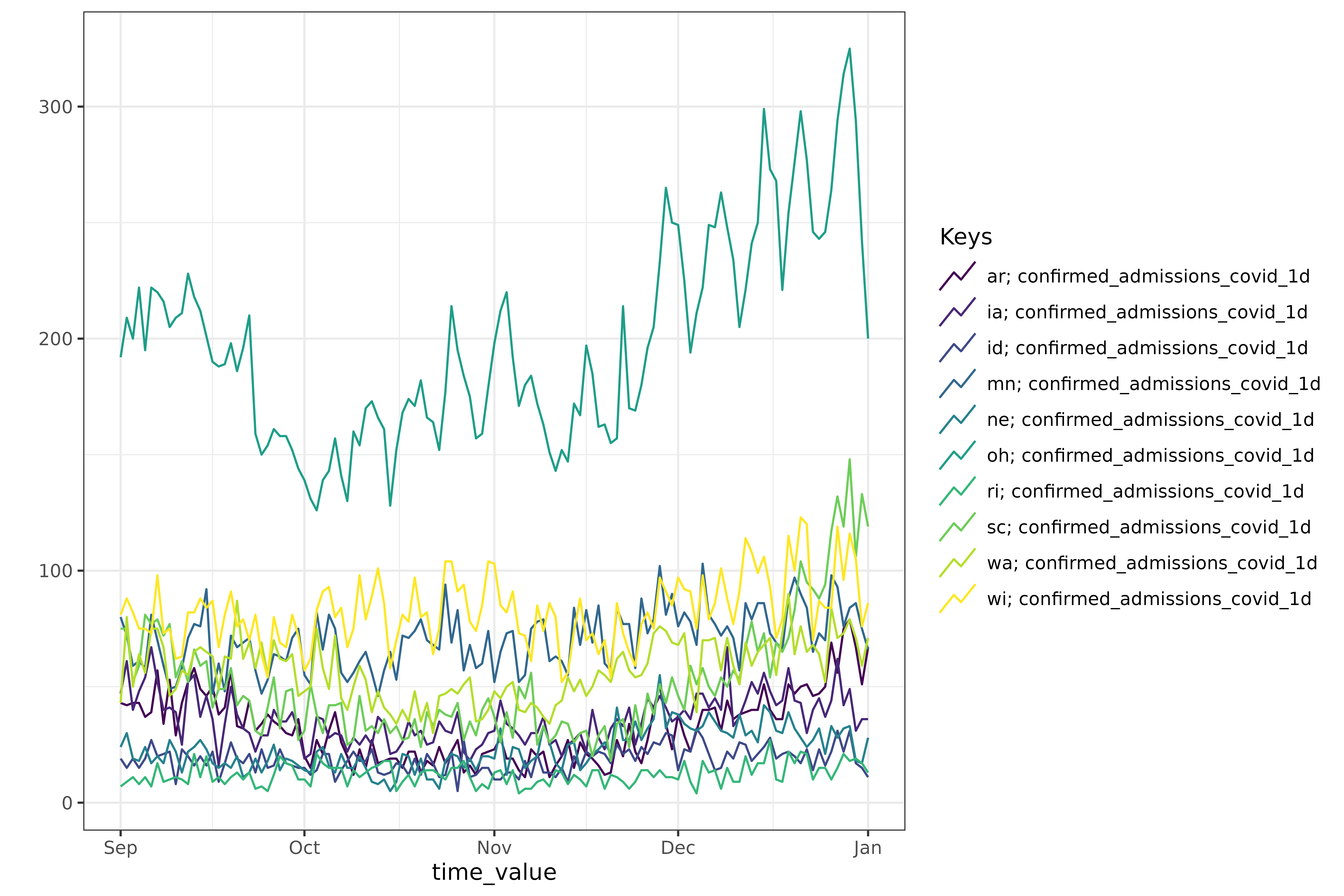
Heatmaps
You can visualize epi_df objects as heatmaps using
plot_heatmap(). This is particularly useful for visualizing
values across many locations simultaneously.
# Static heatmap for a single variable
plot_heatmap(df, value)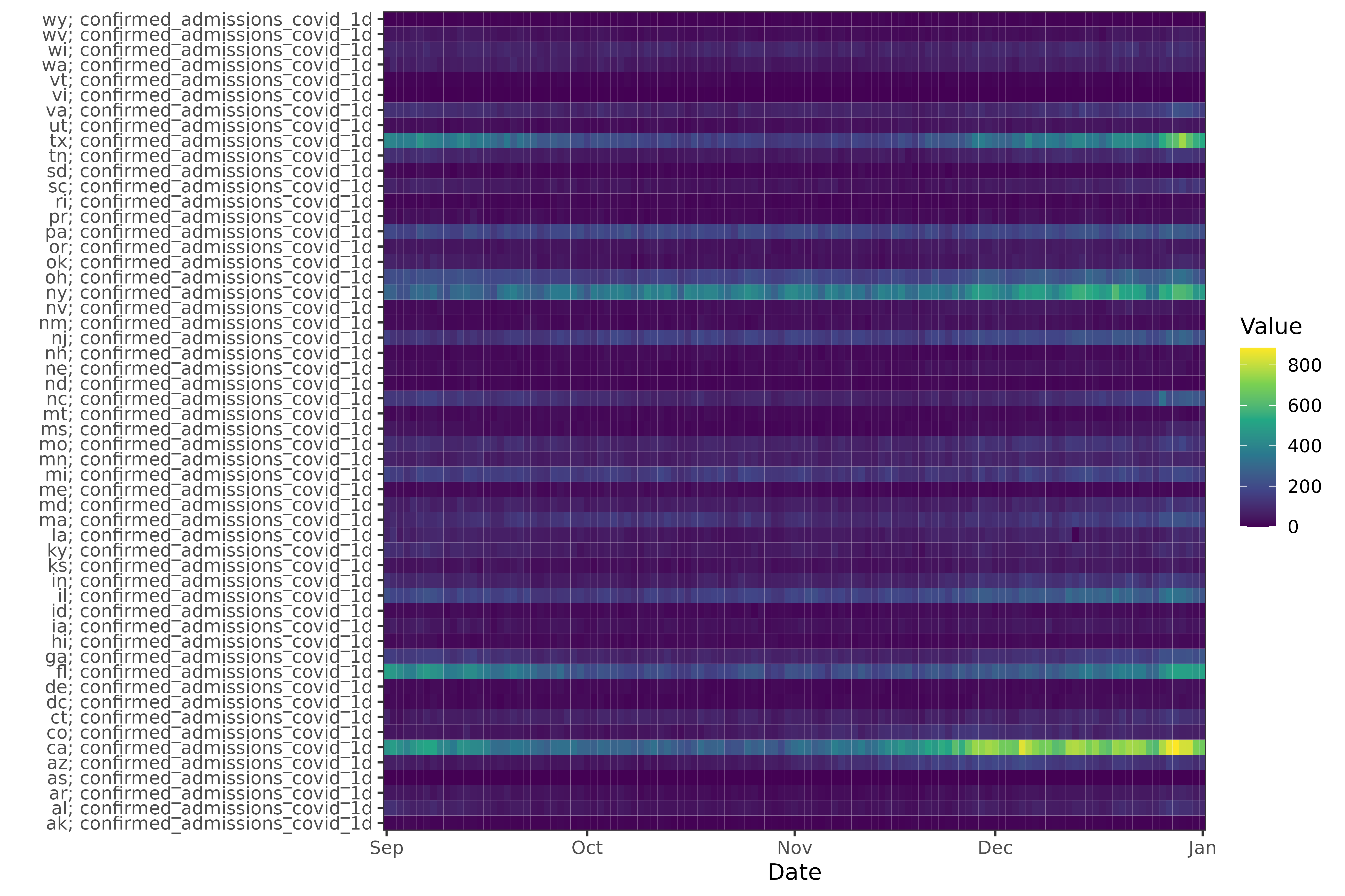
Interactive Plotting
For interactive exploration of data, you can set
.interactive = TRUE in autoplot(). This
returns a plotly widget, allowing you to hover over data
points or isolate certain lines.
# Interactive plot for a single variable
autoplot(
  df, value,
  .interactive = TRUE
)
#> Plotting 54 keys can be hard to read.
#> ℹ Showing a random subset of 10 keys by default.
#> → Select additional keys in the legend on the right.
#> → To see all keys, set `.max_keys = Inf` or use `plotly::style(p, visible =
#>   TRUE)`.
# Interactive plot with facets
autoplot(
  df, value,
  .interactive = TRUE,
  .facet_by = "geo_value",
  .facet_filter = geo_value %in% c("ar", "ca", "ny", "tx", "il", "mi")
)
Interactive Dropdowns
When you have many facets, they can take up a lot of space. Setting
.facet_to_dropdown = TRUE along with
.interactive = TRUE collapses the facets into a single plot
with a dropdown menu.
# Dropdown for geographic locations
autoplot(df, value,
  .interactive = TRUE,
  .facet_by = "geo_value",
  .facet_to_dropdown = TRUE
)
You can also combine faceting and dropdowns for more complex data exploration. For example, dropdown by one key and facet by another:
# Synthetic data with multiple keys
df2 <- expand.grid(
  geo_value = c("ca", "ny", "tx"),
  time_value = as.Date("2023-01-01") + 0:30,
  other = c("source_a", "source_b")
) %>%
  dplyr::mutate(cases = rnorm(dplyr::n())) %>%
  as_epi_df(other_keys = "other")

# Dropdown by 'other' key, facet by 'geo_value'
autoplot(df2, cases,
  .facet_by = "geo_value",
  .facet_to_dropdown = TRUE,
  .interactive = TRUE
)
Plotting epi_archive Objects
epi_archive objects can also be visualized with
autoplot(). This allows you to visualize how data appeared
at different points in time (versions).
# Fetch HHS admissions with version history
df_versions <- pub_covidcast(
  source = "hhs",
  signals = "confirmed_admissions_covid_1d",
  geo_type = "state",
  time_type = "day",
  geo_values = "ar,ia,ca,ny,tx,ks,co",
  time_values = epirange(20221001, 20230101),
  issues = epirange(20221001, 20230101)
) %>%
  rename(version = issue) %>%
  as_epi_archive()
#> Keeping this data in "long" format, with `signal` and `value` columns.
#> → To convert to wide format with a(n) `confirmed_admissions_covid_1d` column
#>   instead, pass `signal_format = "pivot_wide"` instead.
#> → Silence with `signal_format = "add_key"`
#> Adding `signal` to `other_keys`.

# Static epi_archive plot showing all captured versions
autoplot(df_versions, value)
#> Warning: Too many key combinations to display clearly. Showing 6 of 7.
#> → To plot all keys, use `autoplot(..., .max_keys = Inf)`.
#> → To explore all keys interactively, use `autoplot(..., .interactive =
#>   TRUE)`.
#> → To plot specific keys, use `autoplot(..., .facet_filter = ...)`.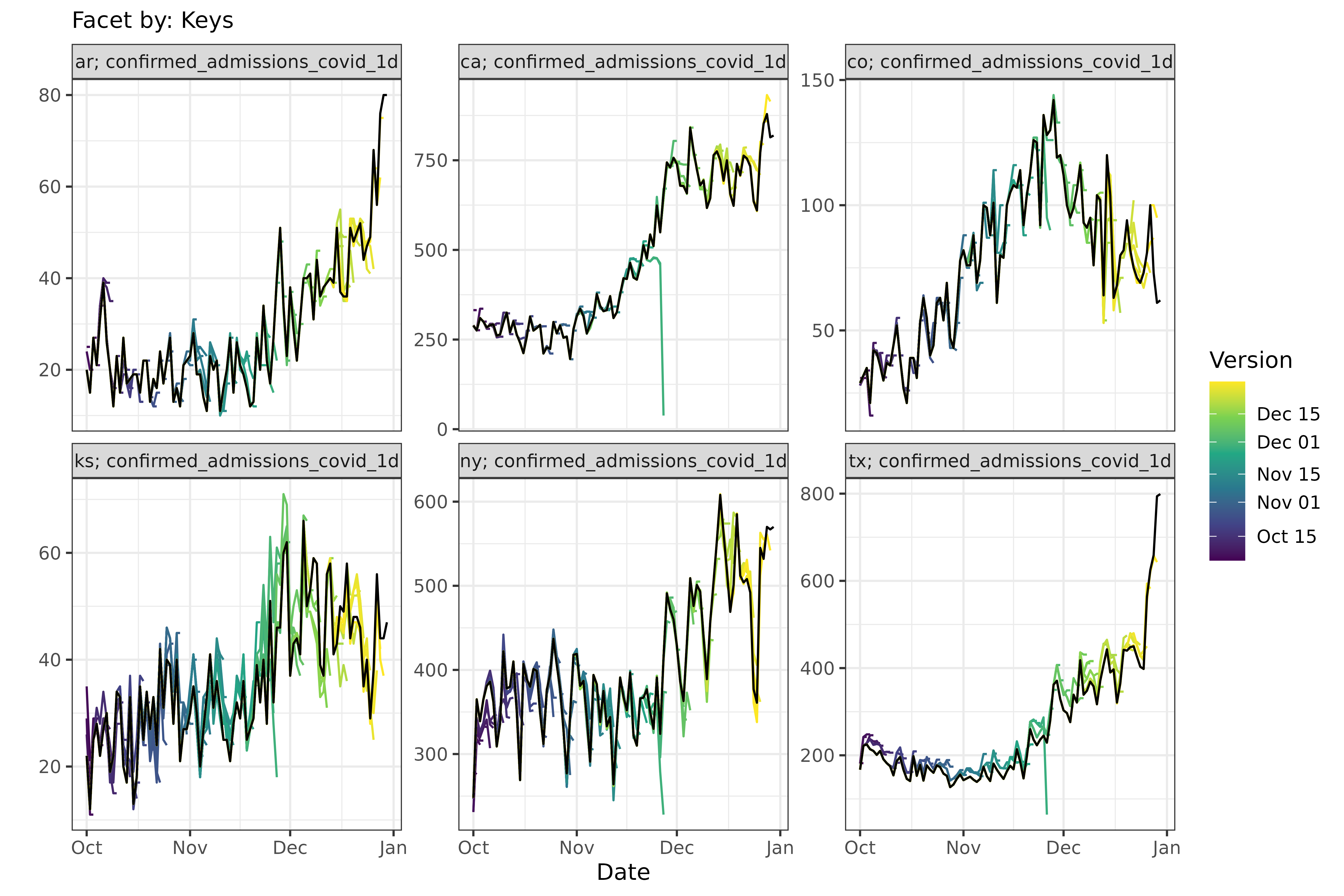
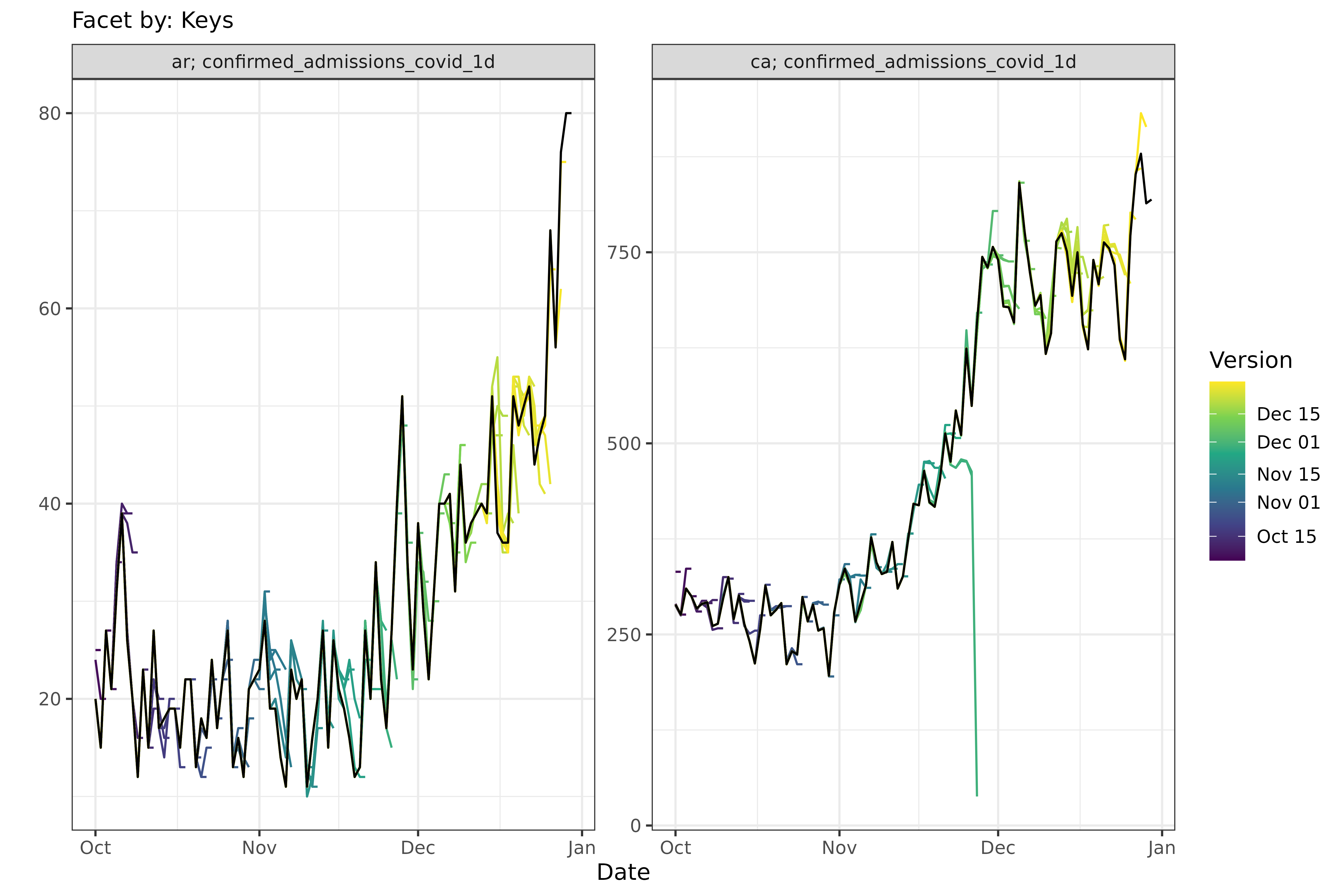
# Static epi_archive plot with filtering
autoplot(
  df_versions, value,
  .facet_filter = geo_value %in% c("ar", "ca")
)
Interactive plots for archives also support the dropdown feature, which can be useful for selecting a specific location or key.