The covidcast package provides some simple utilities for exploring the correlations between two signals, over space or time, which may be helpful for simple analyses and explorations of data.
For these examples, we’ll load confirmed case and death rates per 100,000 population, and restrict our analysis to counties with at least 500 total cases by August 15th.
library(covidcast)
library(dplyr)

start_day <- "2020-03-01"
end_day <- "2020-08-15"

iprop <- covidcast_signal(
  data_source = "jhu-csse",
  signal = "confirmed_7dav_incidence_prop",
  start_day = start_day, end_day = end_day)

dprop <- covidcast_signal(
  data_source = "jhu-csse",
  signal = "deaths_7dav_incidence_prop",
  start_day = start_day, end_day = end_day)

# Restrict attention to "active" counties with at least 500 total cases
case_num <- 500
geo_values <- covidcast_signal(
  data_source = "jhu-csse",
  signal = "confirmed_cumulative_num",
  start_day = end_day, end_day = end_day) %>%
  filter(value >= case_num) %>%
  pull(geo_value)

cases <- iprop %>% filter(geo_value %in% geo_values)
deaths <- dprop %>% filter(geo_value %in% geo_values)
Correlations sliced by time
The covidcast_cor() function is your primary way to
calculate correlations. The first option we have is to “slice by time”:
this calculates, for each time, correlation between the signals over all
geographic locations. This is obtained by setting
by = "time_value":
library(ggplot2)

# Compute correlation per time, over all counties
df_cor <- covidcast_cor(cases, deaths, by = "time_value")

# Plot the correlation time series
ggplot(df_cor, aes(x = time_value, y = value)) + geom_line() +
  labs(title = "Correlation between case and death rates",
       subtitle = sprintf("Per day, over counties with at least %i cases",
                          case_num),
       x = "Date", y = "Correlation")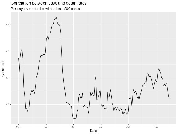
The above plot addresses the question: “on any given day, are case
and death rates linearly associated, over US counties?”. We might be
interested in broadening this question, instead asking: “on any given
day, do higher case rates tend to associate with higher death rates?”,
removing the dependence on a linear relationship. The latter can be
addressed using Spearman correlation, accomplished by setting
method = "spearman" in the call to
covidcast_cor(). Spearman correlation is highly robust and
invariant to monotone transformations (it doesn’t rely on any particular
functional form for the dependence between two variables).
Lagged correlations
We might also be interested in how case rates associate with death
rates in the future. Using the dt_x parameter in
covidcast_cor(), we can lag case rates back any number of
days we want, before calculating correlations.
Here we set dt_x = -10. This means that
cases will be lagged by 10 days, meaning that cases on June
1st will be correlated with deaths on June 11th. (It might help to think
of it this way: deaths on a certain day will be correlated with cases
with an offset of -10 days.)
# Use Spearman correlation, with case rates and 10-day lagged case rates
df_cor1 <- covidcast_cor(cases, deaths, by = "time_value",
                         method = "spearman")
df_cor2 <- covidcast_cor(cases, deaths, by = "time_value", dt_x = -10,
                         method = "spearman")

# Stack rowwise into one data frame, then plot time series
df_cor <- rbind(df_cor1, df_cor2)
df_cor$dt <- as.factor(c(rep(0, nrow(df_cor1)), rep(-10, nrow(df_cor2))))
ggplot(df_cor, aes(x = time_value, y = value)) +
  geom_line(aes(color = dt)) +
  labs(title = "Correlation between case and death rates",
       subtitle = sprintf("Per day, over counties with at least %i cases",
                          case_num),
       x = "Date", y = "Correlation") +
  theme(legend.position = "bottom")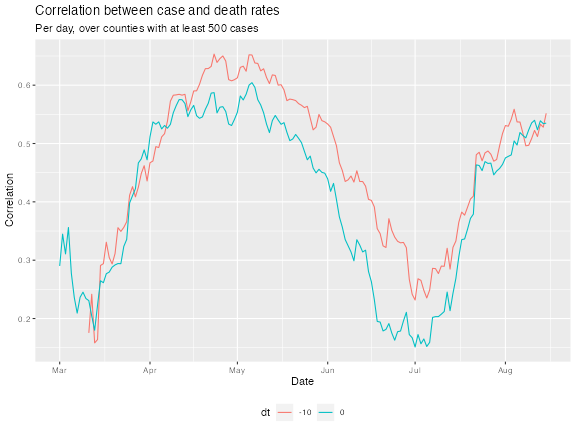
We can see that, for the most part, the Spearman measure has bolstered the correlations; and generally, lagging the case rates back by 10 days improves correlations, confirming case rates are better correlated with death rates 10 days from now.
Correlations sliced by county
The second option we have is to “slice by location”: this calculates,
for each geographic location, correlation between the time series of two
signals. This is obtained by setting by = "geo_value".
We’ll again look at correlations both for observations at the same time
and for 10-day lagged case rates:
# Compute correlation per county, over all times
df_cor1 <- covidcast_cor(cases, deaths, by = "geo_value")
df_cor2 <- covidcast_cor(cases, deaths, by = "geo_value", dt_x = -10)

# Stack rowwise into one data frame, then plot densities
df_cor <- rbind(df_cor1, df_cor2)
df_cor$dt <- as.factor(c(rep(0, nrow(df_cor1)), rep(-10, nrow(df_cor2))))
ggplot(df_cor, aes(value)) +
  geom_density(aes(color = dt, fill = dt), alpha = 0.5) +
  labs(title = "Correlation between case and death rates",
       subtitle = "Computed separately for each county, over all times",
       x = "Date", y = "Density") +
  theme(legend.position = "bottom")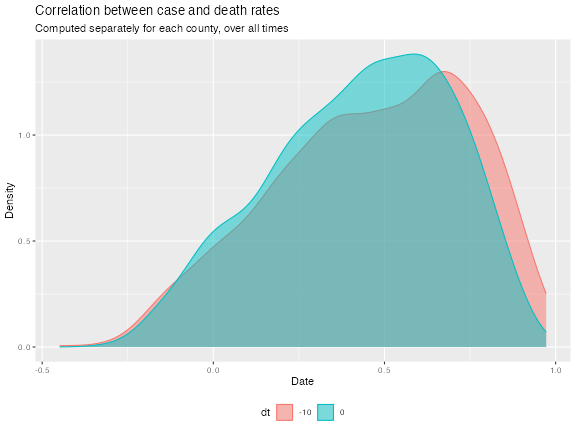
Using some tricks, we can attach the necessary properties to the data
frame so we can plot these correlations in space as a choropleth map,
using plot.covidcast_signal():
# Turn the data into a covidcast_signal data frame so it can be plotted
df_cor2$time_value <- start_day
df_cor2 <- as.covidcast_signal(df_cor2,
                               geo_type = "county",
                               signal = "correlations")

# Plot choropleth maps, using the covidcast plotting functionality
plot(df_cor2, title = "Correlations between 10-day lagged case and death rates",
     range = c(-1, 1), choro_col = c("orange", "lightblue", "purple"))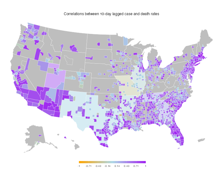
More systematic lag analysis
You could also imagine trying to move the signals with various lags to see at what lag one signal is most correlated with the other. A simple way to achieve this:
# Loop over values for dt, and compute correlations per county
dt_vec <- -(0:15)
df_list <- vector("list", length(dt_vec))
for (i in seq_along(dt_vec)) {
  df_list[[i]] <- covidcast_cor(cases, deaths, dt_x = dt_vec[i],
                               by = "geo_value")
  df_list[[i]]$dt <- dt_vec[i]
}

# Stack into one big data frame, and then plot the median correlation by dt
df <- do.call(rbind, df_list)
df %>%
  group_by(dt) %>%
  summarize(median = median(value, na.rm = TRUE), .groups = "drop_last") %>%
  ggplot(aes(x = dt, y = median)) +
  geom_line() +
  geom_point() +
  labs(title = "Median correlation between case and death rates",
       x = "dt", y = "Correlation") +
  theme(legend.position = "bottom", legend.title = element_blank())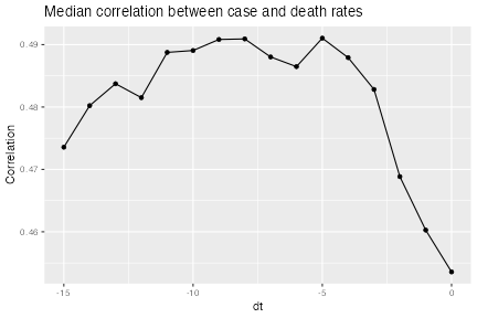
We can see that the median correlation between case and death rates (where the correlations come from slicing by location) is maximized when we lag the case incidence rates back 8 days in time.