Once you’ve fetched some COVIDcast signals using
covidcast_signal(), the returned covidcast
objects can be plotted and mapped in various ways. The data structure is
designed to be tidy and easily wrangled using your favorite packages,
but the covidcast package also provides some tools for plotting and
mapping signals in an easy way.
For this vignette, we’ll use our doctor visits signal as an example; it records the percentage of outpatient doctor visits with COVID symptom codes, as reported by Delphi’s health system partners. We’ll also use incident case counts. Fetching the data is simple:
library(covidcast)

dv <- covidcast_signal(data_source = "doctor-visits",
                       signal = "smoothed_adj_cli",
                       start_day = "2020-07-01", end_day = "2020-07-14")
summary(dv)
A `covidcast_signal` dataframe with 28450 rows and 15 columns.
data_source : doctor-visits
signal : smoothed_adj_cli
geo_type : county
first date : 2020-07-01
last date : 2020-07-14
median number of geo_values per day : 2035
inum <- covidcast_signal(data_source = "jhu-csse",
                         signal = "confirmed_7dav_incidence_prop",
                         start_day = "2020-07-01", end_day = "2020-07-14")
summary(inum)
A `covidcast_signal` dataframe with 45864 rows and 15 columns.
data_source : jhu-csse
signal : confirmed_7dav_incidence_prop
geo_type : county
first date : 2020-07-01
last date : 2020-07-14
median number of geo_values per day : 3276Choropleth maps
The default plot method for
covidcast_signal objects,
plot.covidcast_signal(), produces choropleth maps by using
ggplot2 and the usmap package:
plot(dv)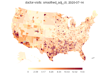
The color scheme is automatically chosen to be similar to that used on the online COVIDcast mapping tool. Also, by default, this map shows the most recent day of data available in the data frame. One can choose the day and also choose the color scales, transparency level for mega counties, and title:
plot(dv, time_value = "2020-07-04", choro_col = cm.colors(10), alpha = 0.4,
     title = "COVID doctor visits on 2020-07-04")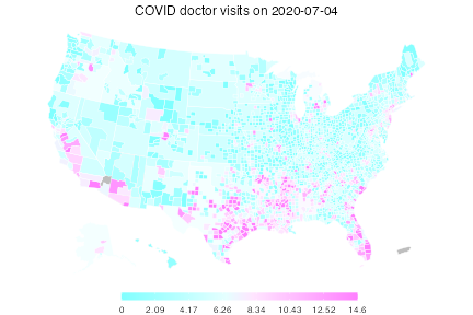
By providing breaks and colors, we can
create custom color scales, for example to have a log-spaced color scale
for incident case counts:
breaks <- c(0, 1, 2, 5, 10, 20, 50, 100, 200)
colors <- c("#D3D3D3", "#FFFFCC", "#FEDDA2", "#FDBB79", "#FD9950", "#EB7538",
            "#C74E32", "#A3272C", "#800026")

# Note that length(breaks) == length(colors) by design. This works as follows:
# we assign colors[i] iff the value satisfies breaks[i] <= value < breaks[i+1],
# where we take breaks[0] = -Inf and breaks[N+1] = Inf, for N = length(breaks)

plot(inum, choro_col = colors, choro_params = list(breaks = breaks),
     title = "New COVID cases (7-day trailing average) on 2020-07-14")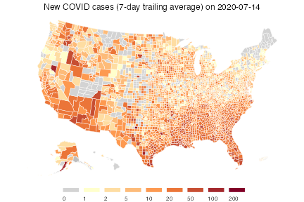
Lastly, we show how we can use custom breaks to (visually) answer the question: which counties have cumulative case rates of at least 1/100?
cprop <- covidcast_signal(data_source = "jhu-csse",
                          signal = "confirmed_cumulative_prop",
                          start_day = "2020-07-01", end_day = "2020-07-14")

breaks <- c(0, 1000)
colors <- c("#D3D3D3", "#FFC0CB")

plot(cprop, choro_col = colors,
     choro_params = list(breaks = breaks, legend_width = 3),
     title = "Cumulative COVID cases per 100k people on 2020-07-14")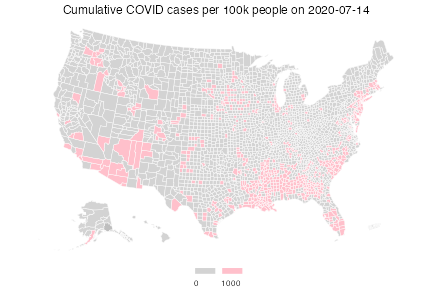
Bubble maps
As an alternative to choropleth maps, we can also quickly plot bubble maps. By default, bubble maps have 8 bubble size bins evenly spaced over the range, where zero always means zero bubble size. The legend shows all bins, interpreted as each bubble size meaning at least the corresponding value.
plot(inum, plot_type = "bubble")Warning in plot_bubble(x, time_value = time_value, include = include, range =
range, : Bubble maps can be hard to read when there is missing data;the
locations without data are filled in gray.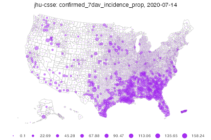
As before, we can of course set customized breaks. As values to the left of the first bin do not get drawn, this map is much sparser, and highlights areas with larger case counts.
Warning in plot_bubble(x, time_value = time_value, include = include, range =
range, : Bubble maps can be hard to read when there is missing data;the
locations without data are filled in gray.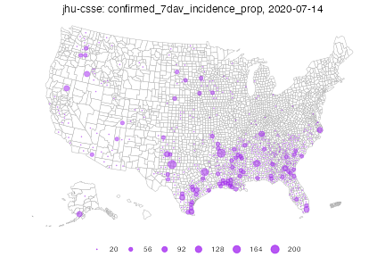
As a final example, suppose we want to plot only counties in the state of Texas. We’d like to compare counts per 100,000 against absolute counts, so we fetch the proportion signal:
iprop <- covidcast_signal(data_source = "jhu-csse",
                          signal = "confirmed_7dav_incidence_prop",
                          start_day = "2020-07-01", end_day = "2020-07-14")
Then we make two maps side-by-side with custom ranges:
library(gridExtra)

breaks1 <- c(1, 10, 100, 1000)
breaks2 <- c(10, 50, 100, 500)

p1 <- plot(inum, plot_type = "bubble",
           bubble_params = list(breaks = breaks1, max_size = 6),
           include = "TX", bubble_col = "red",
           title = paste("Incidence number on", max(inum$time_value)))
p2 <- plot(iprop, plot_type = "bubble",
           bubble_params = list(breaks = breaks2, max_size = 6),
           include = "TX", bubble_col = "red",
           title = paste("Incidence rate on", max(iprop$time_value)))

grid.arrange(p1, p2, nrow = 1)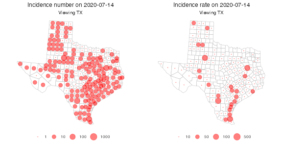
Time series plots
Let’s fetch the doctor visits and case counts, but for all states rather than for all counties. This will make the time series plots more manageable.
dv_st <- covidcast_signal(data_source = "doctor-visits",
                          signal = "smoothed_adj_cli",
                          start_day = "2020-04-15", end_day = "2020-07-01",
                          geo_type = "state")
inum_st <- covidcast_signal(data_source = "jhu-csse",
                            signal = "confirmed_7dav_incidence_prop",
                            start_day = "2020-04-15", end_day = "2020-07-01",
                            geo_type = "state")
By default, time series plots show all available data, including all geographies. A line for every state would be unmanageable, so let’s select a few states and plot all data for them:
library(dplyr)

states <- c("ca", "pa", "tx", "ny")
plot(dv_st %>% filter(geo_value %in% states), plot_type = "line")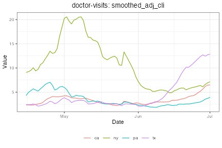
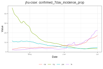
Notice how in Texas, the doctor visits indicator rose several weeks in advance of confirmed cases, suggesting the signal could be predictive.
Manual plotting
Using ggplot2 or your favorite plotting package, we can
easily plot time series manually, without using the
plot.covidcast_signal() method. You can use this to
customize the appearance of your plots however you choose.
For example:
library(ggplot2)

dv_md <- covidcast_signal(data_source = "doctor-visits",
                          signal = "smoothed_adj_cli",
                          start_day = "2020-06-01", end_day = "2020-07-15",
                          geo_values = name_to_fips("Miami-Dade"))
Fetched day 2020-06-01 to 2020-07-15: num_entries = 45
inum_md <- covidcast_signal(data_source = "jhu-csse",
                            signal = "confirmed_7dav_incidence_prop",
                            start_day = "2020-06-01", end_day = "2020-07-15",
                            geo_values = name_to_fips("Miami-Dade"))
Fetched day 2020-06-01 to 2020-07-15: num_entries = 45
# Compute the ranges of the two signals
range1 <- inum_md %>% select("value") %>% range
range2 <- dv_md %>% select("value") %>% range

# Function to transform from one range to another
trans <- function(x, from_range, to_range) {
  (x - from_range[1]) / (from_range[2] - from_range[1]) *
    (to_range[2] - to_range[1]) + to_range[1]
}

# Convenience functions for our two signal ranges
trans12 <- function(x) trans(x, range1, range2)
trans21 <- function(x) trans(x, range2, range1)

# Transform the doctor visits signal to the incidence range, then stack
# these rowwise into one data frame
df <- select(rbind(dv_md %>% mutate_at("value", trans21),
                   inum_md), c("time_value", "value"))
df$signal <- c(rep("Doctor visits", nrow(dv_md)),
               rep("New COVID-19 cases", nrow(inum_md)))

# Finally, plot both signals
ggplot(df, aes(x = time_value, y = value)) +
  labs(x = "Date", title = "Miami-Dade County") +
  geom_line(aes(color = signal)) +
  scale_y_continuous(
    name = "New COVID-19 cases (7-day trailing average)",
    sec.axis = sec_axis(trans12, name = "Doctor visits")
  ) +
  theme(legend.position = "bottom",
        legend.title = ggplot2::element_blank())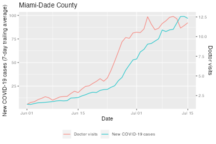
Again, we see that the doctor visits indicator starts rising several days before the new COVID-19 cases do.